
Interpreting Queue Statistics
Understanding the health of your queues is essential for maintaining a stable and efficient integration solution. This microlearning module will guide you through the essentials of queue statistics within the Manage phase of eMagiz. We will cover how to interpret these statistics, what the key metrics mean, and how to use them to monitor queue performance effectively. Let us dive into the basics of queue statistics and explore how to leverage this information to keep your system running smoothly.
If you have any questions along the way, feel free to reach out to us at academy@emagiz.com.
1. Prerequisites
- Basic knowledge of the eMagiz platform
2. Key concepts
This microlearning centers around interpreting queue statistics. By interpreting, we mean: Analyzing the patterns based on the information presented to you. With queue statistics, we mean Various information elements on the queue level that will help to understand the health of the queue.
2.1 General interaction principles
All graphs in the Manage phase are created to provide an easy interaction for users to slice the information as needed. Here are some general guidelines for that interaction.
- Runtime, Queue, and HTTP metrics are sent to the Manage phase every minute, and that interval is runtime specific
- Logs and error messages are sent instantly to the Manage phase
- The average value of the last minute of each metric is sent to the Manage phase
- The graph or the top right menu can select the time dimension. Other graphs will also respond to this selection
- You can return to the main dashboard via the top right button called "Show Main Dashboard."
- The main dashboard contains filter options to select specific runtimes or queues
3. Interpreting Queue Statistics
Assessing the health of your queues is critical in a stable and robust integration solution. One of the aspects of determining the health of your queues is looking at the queue statistics.
To explain how you can correctly interpret the queue statistics, we will explain the dashboard overview on the queue level. In further microlearnings, we will build on this knowledge by defining the key metrics and the other metrics available on the queue level.
To access the queue statistics overview, navigate to Manage -> Monitoring -> Queue Statistics.
3.1 Dashboard Graphs
When the queue statistics are accessed, the first page shows a dashboard of the queue statistics. An example is mentioned below.
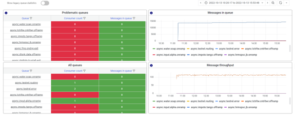
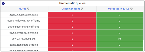
3.1.1 Problematic queues
The problematic queues are displayed top left in the quadrant. Problematic queues are determined by the static alerting setup of the model whereby a value below the threshold of the consumer count or above the threshold of messages in the queue determines whether the queue is in problems or not.
3.1.2 All queues
In the quadrant below, you can see all queues, the reported consumer count, and the messages in the queue. If there are many runtimes reported, use either the sorting option or the hourglass filter button to find the queue of your interest.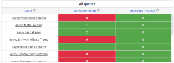
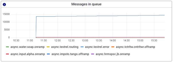
3.1.3 Messages in queue
The message in queue section displays how message traffic is impacted by messages that linger in a queue. When a specific queue shows an unusual pattern in handling messages, the queue graph will reflect this behavior. An example of how this can look is shown below.
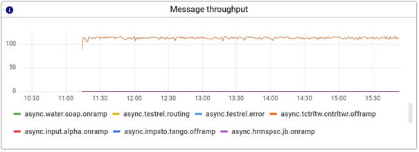
3.1.4 Message throughput
This graph shows the message throughput of each queue. With the help of this graph, you can determine how many messages have been processed by a particular queue within a specific timeframe. Effectively this is a clever combination of the messages in the queue graph and the messages added to the queue graph we had on the previous monitoring stack. This eliminates the need to manually calculate this number to gain insights into message throughput when a specific process behaves unexpectedly.
4. Key takeaways
- Dashboard Overview: Familiarize yourself with the four key graphs on the dashboard, which provide insights into the performance and health of your queues.
- Identifying Issues: Use the graphs to identify problematic queues, indicated by high message counts or unusual throughput patterns.
- Integrated Analysis: Combine insights from all graphs for a comprehensive understanding of queue performance, as this approach provides the most context.
- Effective Monitoring: Leverage eMagiz alerting feature to detect anomalies early and take corrective actions promptly.
5. Suggested Additional Readings
If you are interested in this topic and want more information on it please read the help text provided by eMagiz and read the following link: